Labels

Showing posts with label Comp 1. Show all posts

2/21/2024

Final Magazine

 Here is my final magazine for Component 1 Project - Magazine


Here is a linked flipbook version of my magazine and a google drive folder in the case the pictures does not load, which also includes the pdf file of the magazine.

Self Critical Reflection

 Here is my Self Critical Reflection presentation for Component 1 - Magazine


Here is the link to my presentation incase the embedded presentation does not work

1/24/2024

Double-Page Spread Research & Development

 Here is my double-page spread development

Reflection : Similarly to the rest of my development, task 1 had a helping hand in ensuring I was following my intended plan/idea while also providing me with foundation I could build on while working on the final double page spread. Designing the double-paged spread was definitely my favourite page to design as I think I learnt a lot of skills from it (mostly with Photoshop) and enjoyed documenting learning it all. I am also very fond of the end results. 

Task 1

I am doing the same procedure in my cover page developent for double-page spread development so I will be repeating the instructions.

I take my sketches of my contents page and shoot some picture examples of said sketches. Then, I ttake the two of those sketch ideas to be digitalised (I used Canva). Afterwards, I pick between the two, and continue developing and experimenting with the 4 elements of design (border, hierarchy of type, typeface and colour) in mind. 

Step 1 : Sketches 

Additional information:
  • Almost all but one sketch was taken with a birds-eye view
  • Blue text are comments explaining the picture/layout for further clarification
  • Pink text are my input on some issues with the picture/layout


Step 2 : Take sample pictures

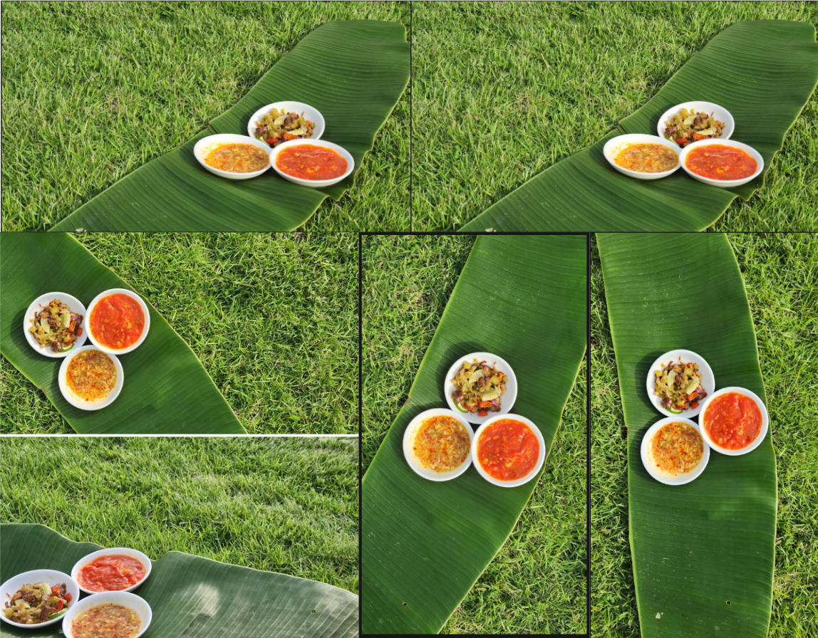
I had run out of these small white serving bowl so I temporarily replaced it with a metal coaster for the time of the shoot but will have it replaced during the actual shoot. I added limes as a placement for the chilli as well as I considered using banana leaves as a container so the green colour helped me visualise them better.

Step 3 : Digitalise 3 


I had tried to avoid the lengthy text by placing the picture horizontally but I found that I'm much more fond of the vertical image layout 

Step 4 : Choose one and experiment


Genre Research

Before going developing my final magazine, I used pinterest to look up examples of double-page spreads from other magazines, I looked for common elements that majority of these examples shared.

Notable similarities :

  • Often both pages share 1 picture/1 picture could take space from both pages
  • Puffs are common on these pages
  • Colours used in the spreads are related to the picture
  • Negative space is covered with texts in columns of three, 
  • Food photographers name are often not seen/placed on these pages and rather on a credit page before the contents page. However, my research shows some articles do feature the author of the article's name on its own page.

Development


Reflection: I did my first photoshoot with my intended location however despite everything planned correctly, unexpected weather brought dark clouds and did not give my pictures any good natural light. So I had reconsidered and decided to go back on another day where the sun would shine brighter. Before leaving however, I did capture pictures of the surroundings like the ocean and sand in the case I would need it in the future. Whilst I had those few days to wait for better weather, I reviewed the pictures and altered my plan. The things i had changed were;
1) Sambal/chilli used; I choose different ingredients that would give the final product a brighter and more colourful result. 
2) Props; I ditched the banana leaf bowls because when I used a banana leaf as the background, they blend into each other. I decided to use white plates instead to help create contrast between the leaf and chilli.
3) Equipment; I used a borrowed camera from my aunt (Canon Powershot G10) for my first photoshoot but I couldnt correctly bring out the colours so I tried using my mom's phone camera (Samsung S23) with the pro camera mode, which gave better results 
4) Photoshoot setting: The beach had a slight slope that was difficult to work with when it came to more watery chilli so I decided to go to a nearby flat terrain of grass to take my pictures and plan to edit in the sand

Here are my some of my pictures on the second shoot;


Here was my first two trials that I had drafted with just the picture I had taken to give me a better vision of what my double-page spread would look like:


END RESULT


To finalize my double-page spread, I had choosen to change a few things after recieving feedback by my teacher. Firstly, my teacher suggested dark green sub-headings with a white body of text for the recipes to help differenciate each recipe which I whole-heartedly agree helped in seperating them. Secondly, I had also added a small article change as I wanted a better flow of the narrative. Lastly, I had added some missing features such as the author and the page number on the bottom left. Other minor details includes tilting the puff to the right more than the left as I felt that its tilt beforehand was too unnecessarily strong.


Here are some additional information to the development process:
  • Video link to masking tutorial for photoshop 
  • Typeface downloaded from dafont.com (Creato display regular and bold, keep calm, catcheye demo)

Contents Page Research & Development

 Here is my contents page development

Reflection: Similarly to my reflection for my front cover development, task 1 was helpful during the photoshoot as I was able to use this blogpost to cross-check between my photos and my sketches/ideas. I had learnt from my front cover development mistakes and made sure to save my screenshots by placing them in a placeholder canva whiteboard (sometimes leaving a comment) so if were to continue developing on a different day, I would not be forgetting what previous changes I had made and be able to place them into this blog. Out of the entire development, I enjoyed making up the articles headings and description the most as I felt like I had to be intentional with each one thus I poured a lot of care into writing them.

Task 1

I am doing the same procedure in my cover page developent for contents page development so I will be repeating the instructions.

I take my sketches of my contents page and shoot some picture examples of said sketches. Then, I ttake the two of those sketch ideas to be digitalised (I used Canva). Afterwards, I pick between the two, and continue developing and experimenting with the 4 elements of design (border, hierarchy of type, typeface and colour) in mind. 

Step 1 : Sketches
  • Blue-Purple text are comments explaining the picture/layout for further clarification
  • Pink text are my input on some issues with the picture/layout

Step 2 : Take sample pictures 

Step 3 : Digitalise 2 


Step 4 : Choose one and experiment

Genre Research

Using pinterest and an online magazine publisher to look up examples of content pages from other magazines, I looked for common elements that majority of these examples shared.


Notable common elements:

  • 'Contents' title always sits at the top of the page, often typeface is the same as masthead and text is in a black/white colour
  • Articles go from 6-10 includes the headline (written in a bold font) and a brief description/summary of the article (written with light font)
  • More common to place magazine issue on contents rather than front cover
  • Page number always at the bottom

Subheadings Research;

I looked back into my magazine development and took my possible coverlines as ideas for my article content. I will be cross-checking each one with my statement of intent to pick and choose article headlines that would be appropiate for my magazine's intention and target audience. I highlighted many article headlines that I quite enjoyed but I need to narrow down my choices to fit my genre conventions, so I will be combining and evaluating my choices to help me bring down my articles down to a maximum of 10. 


Demographic and Psychographic
- adventurous palette, middle income, cost conscious

1) Local small business support and review
- Heartfelt stories of still-standing restaurants
- Hidden gems
- Dining diaries
- Celebrating homegrown chefs
- Sidewalk eats
- Taste of the town
- Street food stars
- Worth-while warungs

2) Homemade authentic recipes/Everyday cooking
- Your delectable dishes
- Mama's Recipes: Heartfelt homemade meals
- Relish in the spice -> A spotlight on spice
- Budget bites
- Dining on a dime
- Loving leftovers
- Leftover magic

3) Culinary icons of Indonesia
Famous dishes of Indonesia; Nasi goreng, Sate, Rendang, Gado-gado, Pisang goreng
Famous chefs from Indonesia; Rinrin Marinka, Juna Rorimpandey
- Inside the kitchen: Insider tips and tricks 
- Indulge without apology: martabak, the ultimate form of guilty pleasure.
- Rinrin Marinka's recommendations
- Juna Rorimpandey's jottings on perfecting recipes

Here I will be combining and further evaluating my choices by asking feedback from friends. I will also be writing the short descriptions within each headline:
  • A spotlight on spice
    • Explained in my magazine article development 
    • "Bringing you recipes to start your flavourful journey with spice"
  • Hidden gems of still standing restaurants
    • Fitting to my intended content of supporting local restaurants. The word "gem" implies to my audience that the restaurant is high quality, precious, and valuable. However, I have 2 other headings already that share a similar intention and want to avoid repetitive content so I decided to cross this article out as this was my least favourite out of the 3.
  • Worth-while warungs (Rinrin Marinka's recommendations)
    • The word "warung" which are small (often cheap) restaurants located on the streets of Indonesia, "worth-while" and the star appeal of Rinrin Marinka all helps create a message that can directly target my audience as they imply that these affordable, inexpensive eateries are trusted and fulfilling to even a master of cuisine. This is appealing to my audience of frugal spenders who still crave for a delicious meal.
    • "Explore an experts endorsement on local kitchens around town in our exclusive interview with her"
  • Mama's Recipes; Heartfelt homemade meals
    • Explained in magazine development
    • "Sharing our favourite comfort foods from our favourite person"
  • Loving leftovers; scraps to treats
    • Psychographic of target audience being middle income households and cost-conscious makes it more likely that my target audience will dislike having wasted food. This headline also encourages my audience to embrace creativity in the kitchen which targets the personality psychographic of adventurous palette.
    • No waste left behind! Get creative in the kitchen and cook effortless eats
  • Street food stars; recognising homegrown chefs
    • This headline fulfills my intention of supporting local restaurants and chefs who, by the authors belief, need more celebration for their skill, creativity and dedication to the art of cooking (which also targets my audiences who are appreciative towards the origins behind dishes)
    • Showcasing talent and the hard-work of underappreciated culinary artisans in our go-to rendang stores
  • Our community collaboration of kitchen creations 
    • Agreed upon discussion with friends that this headline felt plain and unnecessarily lengthy so I changed it to 'Your kitchen creations' which feels more personal and direct
    • Description references community and uses the word "our" in order to build a connection with the reader and seem immersive and intimate. This can help gain audiences loyalty to magazine and become more engaging for the reader.
    • Our communities collection of culinary ideas, tips, tricks and techniques written, tested and proved by you
  • Sweet surrender to guilty pleasures
    • Often food magazines have desserts showcased at the end so to conform to this convention, I added this headline. The younger age group of my target audience may enjoy this section as sweets will appeal to them more. However, the phrase "join us in indulging" as the description could encourage my audience to not fear spending to gain a source of enjoyment as they would not be alone will appeal more to older audiences as they're often more diet-aware. Therefore this will create a deeper relationship with my audience. 
    • Join us in indulging in Indonesian desserts without apology like theres no tomorrow

Development


End Result


For my final contents page, I included just the magazine's website along with the current issue, a choice informed by common practices I discovered during my research. Additionally, I eliminated the underline from the title 'Contents.' Upon revisiting the task, I found that the underline contributed to an unnecessary sense of clutter on the page so I thought it was best to remove it.

Front Cover Development

 Here is my front cover research and development

Reflection : I found task 1 with the sketches a big help when it came to my photoshoot date as I could easily pull out my blog to check back with my plans. Doing the task made it much easier to start as I had a plan and just simply had to execute it when it came to developing my final front cover. Despite that, I did find the development documentation task severly tiring and uninteresting. I had an issue of forgetting to save the screenshots of my development and had to recreate previous versions at times thus becoming an long-lasting task, which felt draining.

Task 1

Before I begin my development, I will brief the instructions my teacher had reccommended that I do to help me picture my front cover. I will be taking my sketches of my front cover and shoot some picture examples of what they would look like. Then, I take the two of those sketch ideas to be digitalised (I used Canva). Afterwards, I pick between the two, and continue developing and experimenting with the 4 design of design (border, hierarchy of type, typeface and colour) in mind. 

Step 1 : Sketches


Step 2 : Take sample pictures 


Step 3 : Digitalise 2 


Step 4 : Choose one and experiment


Genre Research

Using pinterest to look up examples of content pages from other magazines, I looked for common elements that majority of these examples shared.


I've noted several things doing this research that I will place as bullet points below.

Common elements in front cover: 

  • Combined with my previous research (found in blogpost titled Magazine Research), I found that food magazines tend to use puffs and banners
  • Majority of food magazines uses a birdseye view, focusing on one dish at a time. They also utilise the shape of the plate to create interesting geometric layouts.
  • Main coverlines often uses the same typeface as the masthead, possibly to create unity and look more cohesive
  • Most coverlines uses a light sans-serif (not too attention grabbing compared to main coverline)
  • Issue date and price are not shown in any of these examples, however when it does, the text box will usually sit nearby the masthead or barcode.
  • Average of 3-4 coverlines in each magazines
  • All texts will go around the dishes shown, never covering a dish.
  • Colour pallete is small in terms of text, consisting of a main colour- white or black- and an accent colours choosen by its relation to the subject (pink with meat, red text  with red sauce in dumplings) 
  • Masthead always sits at top of page

Development


Here I linked the tutorial on Youtube I had used to learn about content-aware fill tutorial and patch tool for photoshop.


End Results

1/17/2024

Magazine Layout Tutorial

In this post I will demonstrate some basic design skill that I learned in class

Task 1:

My teacher first tasked me to an exercise of drawing a multiple (minimum of 5) covers for my magazine within a span of 5 minutes. Here are my sketches. 


Reflection : I found these exercise simple yet fun to do. The time limit forced me to move on to another sketch after finishing one, which I think was an effective way of brainstorming because I did not get stuck on only one draft and was able to expirement in different ways I could layout a magazine cover. These sketch weren't very detailed due to the time limit, however I think I got the main idea down such as placement of masthead, main coverline, image and barcode. However the short time I was given also meant I wasn't able to look back on my research and could only do it off the top of my head so I think this could've been a reason as to why my sketches were quite plain and generic as overhead shots were extremely common within the genre and was the first thing I could think of. I would definitely try to find more interesting shots i could do.

Task 2 : 

Next, my teacher gave my class a template to practice making various magazine layout on google draw. Similar to the task 1, I was told to make various layouts of magazine covers with a template that was given, with a time limit of 10 minutes. Here is the template my teacher gave;

Here were the magazine cover layouts I made in those 10 minutes, labelled with numbers from 1-5; 


Reflection: I found this task of rearranging prepared material and experimenting extremely fun, it was a familiar feeling to dress-up games. I enjoyed finding new ways to place different text boxes without much care in mind. Despite actually liking how most of turned out, I did have some problems where I found the positioning of some texts box quite awkward like the main coverline on magazine 4 even when I've shuffled it around multiple times. I also think I could have experimented more if it were not for the time-limit.
 

Task 3 :

 After the timer ran off with my 5 covers, my teacher explains to my class about the 4 fundamentals when designing magazine covers which consists of borders, hierarchy of type, typeface, colour (explained further below). I was then told to go back and revise my magazine covers where I will now consider and apply these elements.

  • Borders

Borders are placed on magazine as a boundary. All elements of a magazine cover (including texts, images, etc) should not go past the border and be correctly aligned to said border thats been set inorder to properly organize content, prevent visual clutter and appear neater, thus seem more professional. 

  • Hierarchy of type

Hierarchy of type considers the way people read, or otherwise known as visual hierarchy, and capitalises it by adjusting text's (like the masthead and main coverline) positioning- from top to bottom and or left to right- based on its importance. This will help audience quickly navigate content easily with the use of emphasized key information. For example, the masthead and main coverline will need to stand out by having a unique feature that differenciates them from the rest of the text with a different size, font weight, typeface, colour and much more.

  • Typeface

Typeface is defined as a particular design of type used in a text which is an essential part of the magazine's visual identity as it can determine the magazine's personality and readability. Certain typefaces have themes and conventions which tie them to certain tones. Sans serif, for example, has a more relaxed and modern theme compared to serif's classy and sophisticated theme. This slight difference in typefaces can influence the magazines reach towards its target audience.

  • Colour

Colour choices greatly impact the aesthetics of a magazine design as colours carry connotations that could evoke emotions, set an atmosphere or create visual intrigue to peak the interest of audiences. They could guide the readers attention or complete the magazine's cohension and attrativeness.

Here are my revised magazine covers:


Reflection: I, unfortunately, was unaware of this new task beforehand and had not saved my previous designs on their own page. This caused me to go back and recreate the magazine layout before then applying my new found knowledge of design essentials. Because of this, I was unable to do all 5 of the magazine I created, only finishing 3 (number 2, 3, 5). I assume because this- added with of the time crunch of this task- was the reason behind my layouts feeling rather disappointing as there were just slight change to colour and typeface. Nonetheless, this was a great lesson that taught me to pay attention to the 4 elements of design to guarantee my magazine can stand out amongst its competitors. I'm proud of myself for having subconsiously following the border rule when designing these layouts but I still have much to improve on.