Here is my double-page spread development
Reflection : Similarly to the rest of my development, task 1 had a helping hand in ensuring I was following my intended plan/idea while also providing me with foundation I could build on while working on the final double page spread. Designing the double-paged spread was definitely my favourite page to design as I think I learnt a lot of skills from it (mostly with Photoshop) and enjoyed documenting learning it all. I am also very fond of the end results.
Task 1
I am doing the same procedure in my cover page developent for double-page spread development so I will be repeating the instructions.
I take my sketches of my contents page and shoot some picture examples of said sketches. Then, I ttake the two of those sketch ideas to be digitalised (I used Canva). Afterwards, I pick between the two, and continue developing and experimenting with the 4 elements of design (border, hierarchy of type, typeface and colour) in mind.
Step 1 : Sketches
- Almost all but one sketch was taken with a birds-eye view
- Blue text are comments explaining the picture/layout for further clarification
- Pink text are my input on some issues with the picture/layout


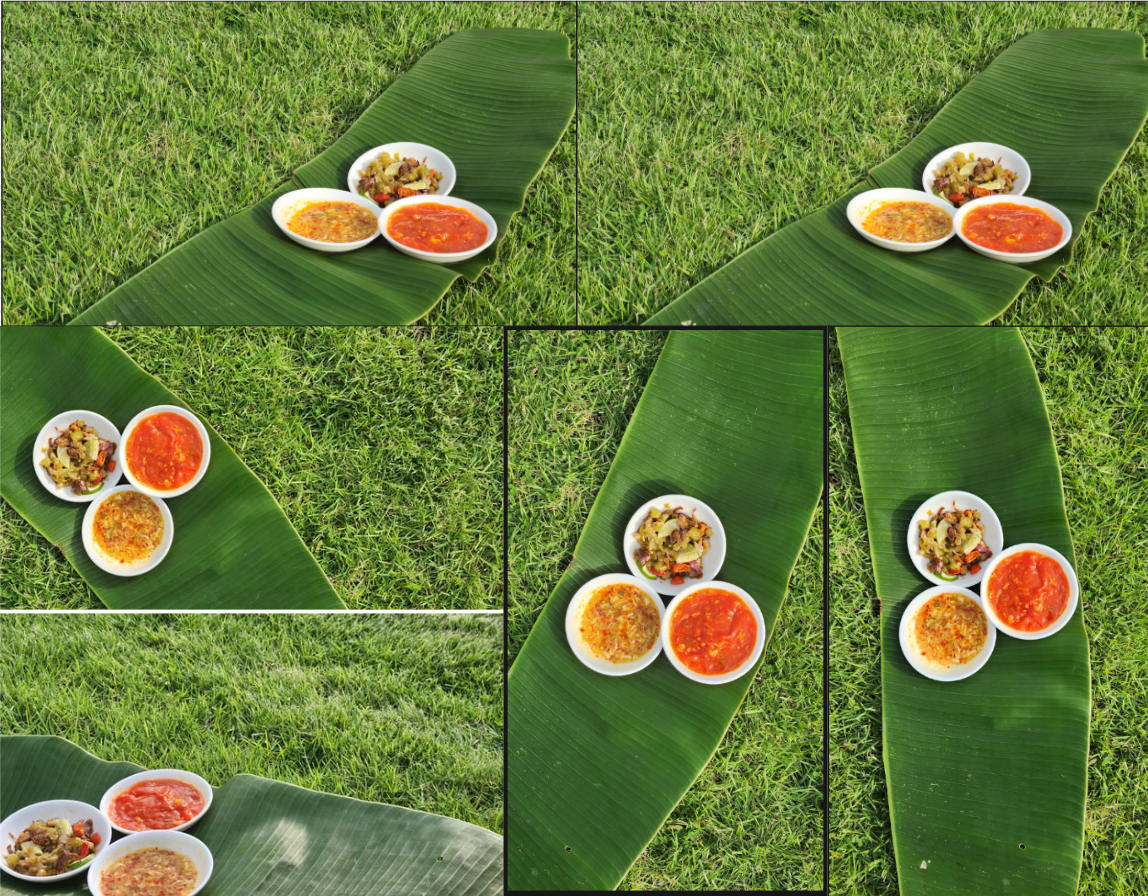
Step 2 : Take sample pictures

Step 3 : Digitalise 3


Step 4 : Choose one and experiment


Genre Research

Notable similarities :
- Often both pages share 1 picture/1 picture could take space from both pages
- Puffs are common on these pages
- Colours used in the spreads are related to the picture
- Negative space is covered with texts in columns of three,
- Food photographers name are often not seen/placed on these pages and rather on a credit page before the contents page. However, my research shows some articles do feature the author of the article's name on its own page.
Development

1) Sambal/chilli used; I choose different ingredients that would give the final product a brighter and more colourful result.
2) Props; I ditched the banana leaf bowls because when I used a banana leaf as the background, they blend into each other. I decided to use white plates instead to help create contrast between the leaf and chilli.
3) Equipment; I used a borrowed camera from my aunt (Canon Powershot G10) for my first photoshoot but I couldnt correctly bring out the colours so I tried using my mom's phone camera (Samsung S23) with the pro camera mode, which gave better results
4) Photoshoot setting: The beach had a slight slope that was difficult to work with when it came to more watery chilli so I decided to go to a nearby flat terrain of grass to take my pictures and plan to edit in the sand


END RESULT


To finalize my double-page spread, I had choosen to change a few things after recieving feedback by my teacher. Firstly, my teacher suggested dark green sub-headings with a white body of text for the recipes to help differenciate each recipe which I whole-heartedly agree helped in seperating them. Secondly, I had also added a small article change as I wanted a better flow of the narrative. Lastly, I had added some missing features such as the author and the page number on the bottom left. Other minor details includes tilting the puff to the right more than the left as I felt that its tilt beforehand was too unnecessarily strong.
- Video link to masking tutorial for photoshop
- Typeface downloaded from dafont.com (Creato display regular and bold, keep calm, catcheye demo)